Project / 04
Mount Vernon School Online
UX / Digital Experience
Rethinking an online school's digital experience around the questions prospective families actually ask.
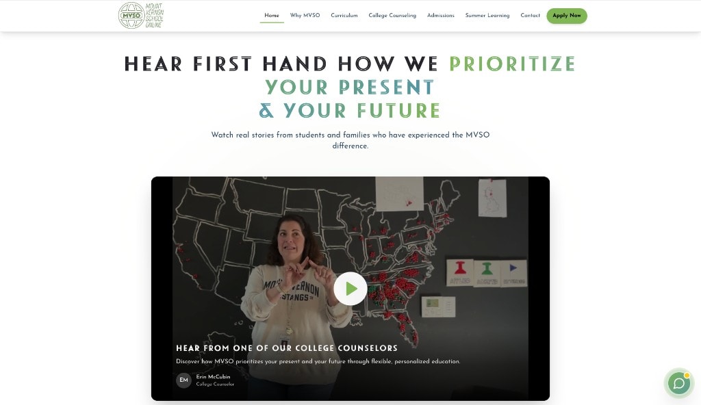
- Status
- Real Redesign Project
- Role
- User Experience Designer
- Focus
- UX Design, Information Architecture, Visual Direction
- Type
- Real redesign
Mount Vernon School Online already had information. The challenge was making that information easier to understand. I helped lead a redesign of the digital presence: structure, visuals, messaging, and the broader experience for prospective students and families.
The problem / context
What I was solving
Education websites often contain enormous amounts of information. The design challenge was deciding what someone needs now, and what can wait: navigation, content hierarchy, messaging, density, readability, and the prospective-family journey.
My role
How I worked
I helped lead the redesign, leveraged stakeholder feedback, rethought information hierarchy and site structure, contributed to visual direction and messaging presentation, redesigned key pages, and helped improve digital consistency for students and families.
Title
- User Experience Designer
Process flow
How it moves
- 01Discover
- 02Understand
- 03Explore
- 04Decide
The process
Thinking, versions, evidence
- 01BEFORE
Existing experience
Auditing the original site for real structural issues, not fabricating problems. Where did families get stuck? What was buried?
- 02STAKEHOLDER FEEDBACK
Stakeholder feedback
Notes, comments, meeting feedback, and marked-up screens. Listening shaped the information architecture more than a visual moodboard.
- 03STRUCTURE
Wireframes → system
Sitemap, navigation, page grouping, then layouts before styling. Typography, buttons, cards, spacing, and imagery as one system.
- 04CURRENT PRODUCT
Before / after & responsive
Side-by-side page comparisons and desktop / tablet / mobile views. Live site: mvso.vercel.app.
Identity
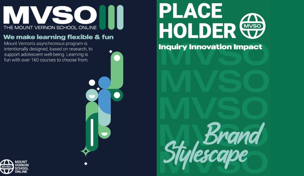
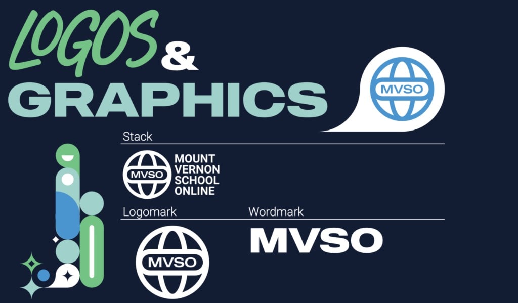
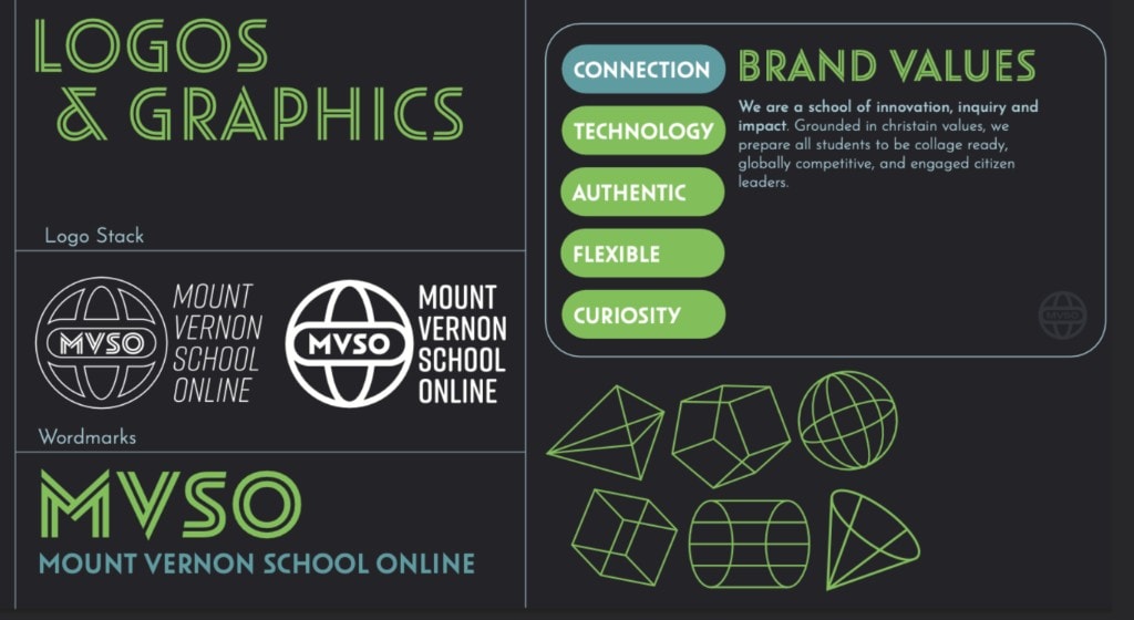
Campaign
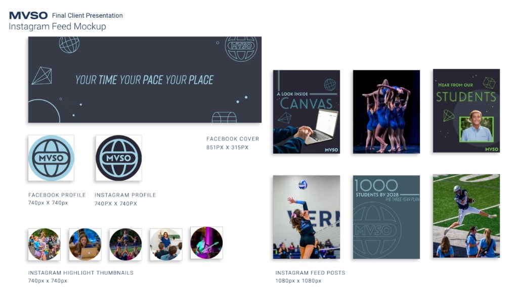

- Hierarchy: what someone needs now vs. later.
- Feedback first: structure before decoration.
- Consistency: one system across pages and devices.
Outcome
Where it landed
A clearer hierarchy, stronger information organization, more cohesive experience, clearer messaging, and improved digital consistency. No invented conversion metrics, just a more useful experience for the people who need it.
Reflection
“This project made me think less about what I wanted users to see and more about what they were actually trying to find. Listening became part of the design process.”